Deep within data lies stories that can help businesses of all shapes and sizes see hidden detail – and act on it. Take a US healthcare provider, for example, who came to us with a pressing issue: the greatest cause of its patient dissatisfaction was due to waiting times. When were the longest peaks? Where was the epicenter of the backlog? And once this was known, what targeted processes could be introduced to speed things up? Our data visualization experts revealed all this, and much more, in a real-time dashboard that reduced wait times by 13%.
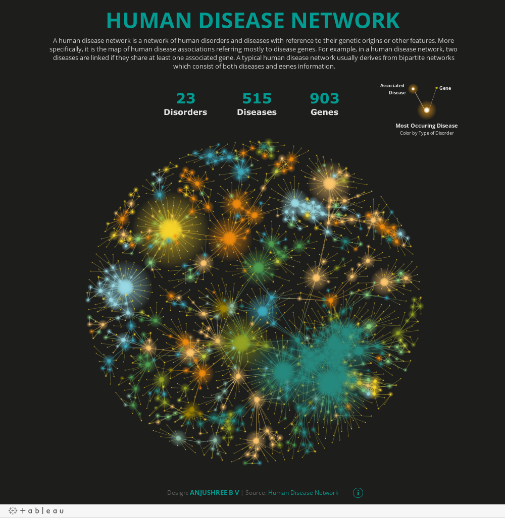
So talented are our data viz specialists that they can turn pretty much anything into a dashboard that packs a punch and educates. Like Yash Shah, our Data Analytics Consultant – whose ‘World of Tea’ was named Viz of the Day (VOTD) by Tableau recently.
“Tea is always central to any meaningful conversations which I have in my life,” explains Yash. “And so, when I was back in India chatting to some friends, with a cup in hand, the idea of creating a data visualization about tea struck me suddenly, as it’s such an integral part of my every day. I wanted to visually display all the information I could find out about it – and share that with others. There was so much to do with the data: 1,500 flavors of tea just for starters – 200 of which come from India.”
We’re biased, but to us, it’s clear why Yash won the VOTD accolade for his ‘World of Tea’. It’s certainly no mean feat. Tableau’s expert team scrutinizes many data visualizations every day; competition is stiff. The winners are added to the Tableau Public website, shared via social media streams, and sent out via email to VOTD subscribers. Put simply, they’re seen by thousands of people worldwide, providing inspiration and learning. It’s this immediate knowledge-sharing impact of data visualizations that Yash believes is so powerful – whether in the creative or corporate world.
“For businesses, data that is translated into these kinds of visuals gives great clarity to weighty subjects,” says Yash. “Images can give a huge boost to concepts and information; complex narratives can be conveyed cleverly in an instant. The impact is great.”
Originally from Mumbai, Yash started using Tableau when he moved to Canada to study a graduate program in Data Analytics and Data Science from Durham College. He’d taken a few courses on it back in school. Then, when he landed an internship, he decided to hone his skills on the platform – and use it to create ‘out of the box’ visuals in his spare time. Now that he’s a fully-fledged member of the Calligo team, he’s determined not to lose any of the expertise he’s taken so long to fine tune. And to continue to tell stories through the power of data visualization.
“Storytelling is important to me, whether I am creating a visualization for a client, or as a hobby outside of work. I want viewers to be pulled towards the images – glued to them and absorbed in the content. For me, a picture speaks a thousand words.”
Back to Yash’s day job, and this is exactly why clients come to our data visualization team – to decipher ostensibly complex data sets. Instead of hidden insight, these (often beautiful) creations bring collective understanding and clarity – enhancing business performance across a huge variety of sectors.
You can download our data visualization portfolio here – and discover how we’ve helped global clients cut through the noise with actionable visual analytics.