
How we guided a customer – Community Transit – through designing dashboards and data visualizations that would answer the organization’s most pertient, urgent and valuable questions and put data at the heart of decision-making.
You know that there’s valuable data within your business applications that could help you make better business decisions and achieve improved business results. However, you might not be using it in a way that leads to those outcomes.
So how do you derive the maximum benefit from your data?
What’s Your Goal?
The first step to unlocking the value of your data stored within business applications is to have a clear goal in mind. What are you hoping to gain from analyzing this data – do you want to boost sales? Are you hoping to improve your marketing ROI, or would you like to streamline operations?
Goals for a data project are akin to having a road map before you set off on a trip. By knowing where you’re going, you won’t waste gas, and you’ll arrive at your destination faster. While the scenic route is pretty, you might just end up in the middle of nowhere.
What Kinds of Questions Should You Be Asking?
After you’ve set your goals, you must decide what questions you’re going to be asking of your data. Just looking at information isn’t going to help you make better decisions. You need to ask the right questions of your data to make smart choices, data-driven decisions and meet and exceed business goals.
But, what sorts of questions will guide your company in the right direction so it’s more efficient and profitable?
A first step to determining what direction your business should go in is to determine key performance indicators. KPIs will vary from organization to organization as well as from department to department. That’s why it’s vital to keep KPIs small in scope and to track them constantly and consistently so that they provide an accurate measurement of performance.
“The most important question you should ask is the one companies overlook the most: how can employees use this data to solve problems and get better results?”
Once you’ve determined KPIs, you’ll find yourself on a progression of asking increasingly more advanced questions. This is known as the analytics maturity spectrum. The questions on the farthest (or earliest) part of the spectrum are descriptive (“What happened here?”). Then, they move into diagnostic (“Why did they happen?”), and from there, they shift into a predictive mode (“What’s going to happen next?”). The other end of the spectrum, the most mature end, asks prescriptive questions (“What can we do to make things better?”).
It’s important to inventory your different sources of data to figure out which will help you answer the relevant questions. There are a number of data sources across the company that are repositories of valuable information – they exist in the finance, marketing, sales, human resources, and operations departments.
The most important question you should ask is often the one companies overlook the most: how can employees use this data to solve problems and get better results? Giving employees access to the data through a platform that allows them to pull data from different sources enables them to run their own queries that may lead to creative responses to problems. Executives should also have the ability to generate and view scorecards that let them make mission-critical decisions.
Case Study: Community Transit

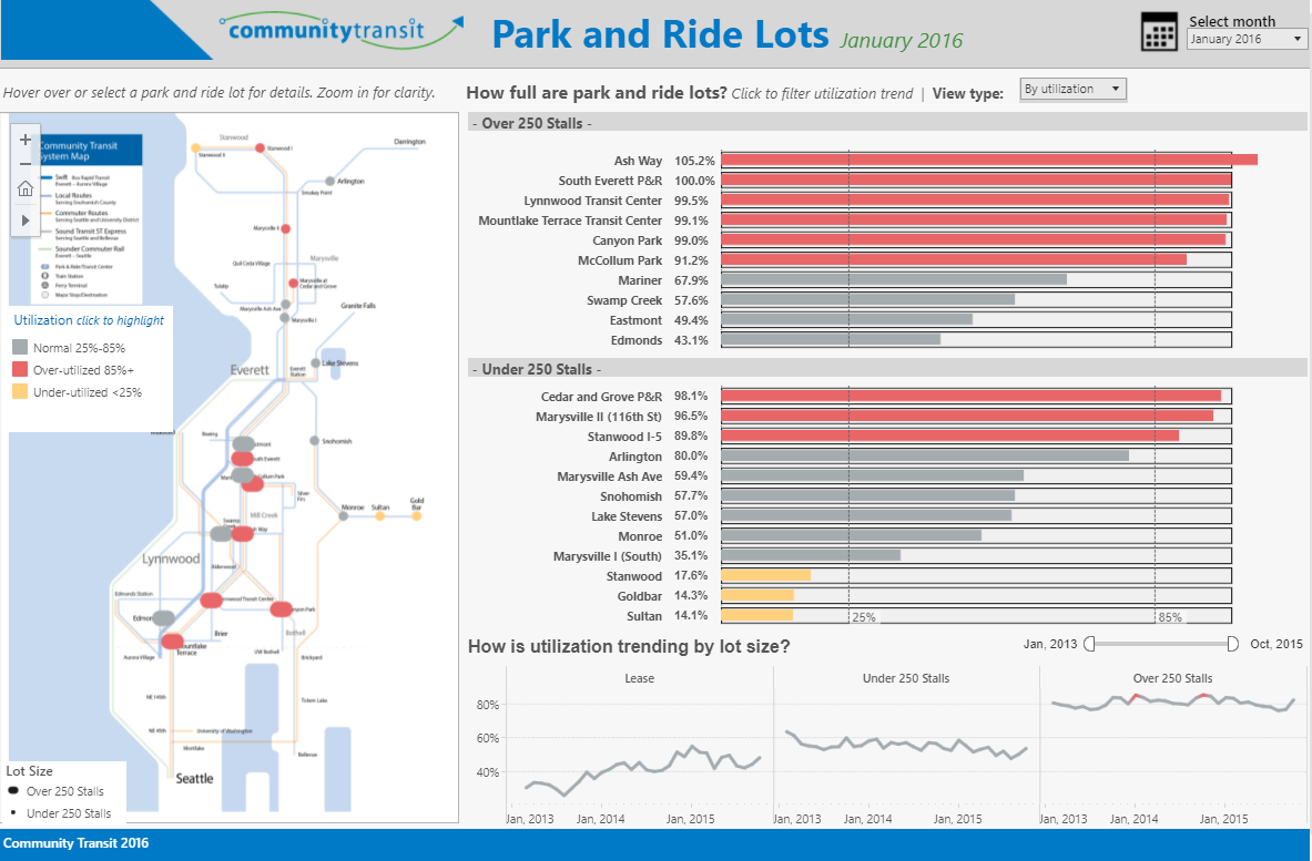
Community Transit is a public transportation provider based in Snohomish County just north of Seattle. It operates park-and-ride lots across Seattle and the surrounding areas. To ensure the public were benefiting from the service, Community Transit’s leadership team wanted to know how well their services and facilities were being utilized across the city of Seattle.
After speaking to Calligo’s Data Insights team, Community Transit leadership team determined that not only did the organization want to know how well their services were being used, but also if they could identify any shortfalls or trends in the service and monitor any over or under-resourced parking stations.
Once the goals had been determined, the Calligo team worked on finding and exacting the relevant data across multiple data sources. The team then cleansed and enriched the Community Transit data to ensure only suitable and necessary data was used before deploying it on Calligo’s technology partner and industry-leading analytics platform, Tableau.
To ensure Community Transit employees could easily access the information they required and understand the usage and trends, Calligo’s Data Visualization team created a dashboard that focussed on the metric of the services and facilities utilization. By hovering over the map of parking lots, users can learn more about the rate of lot utilization and filter by usage trends. Tooltips provide even more granular detail for users.
![]()
You can view and interact with the full Tableau dashboard, here.
“Thanks to the Calligo-Tableau dashboard, Community Transit has been able to make decisions about how best to manage the parking lots it operates.”
Thanks to the dashboard, Community Transit has been able to make better data-driven decisions about which parking lots require more active management (such as monitoring parking violations and maintaining payment machines), which lots need to be expanded because they can’t serve enough customers, and which lots aren’t being used enough and need to be closed.
When having a clear goal in mind, and asking the right questions of your data, you can make smart and better-informed business decisions, improving business outcomes and operations.
Calligo’s Data Insight Services enables organizations to grow closer to their data and use it safely to uncover possibilities, answer questions and resolve business challenges. You can explore our Data Insight Services by clicking below or alternatively, contact our team directly here.
