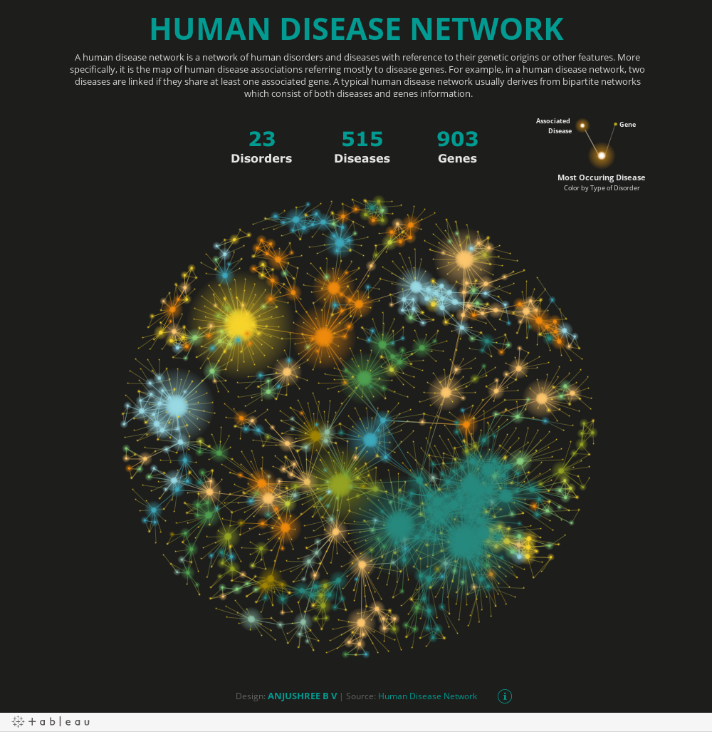
Did you know that breast cancer is linked to 19 different genes and has 30 associated diseases? Or that Leukemia is linked to 37 different genes, with 26 associations? Neither did we. But in this insightful, interactive Human Disease Network data visualization, the information is candid and clear – for everyone to decipher. Compelling, concise – and, above all, beautiful.
The author and artist? Calligo’s Senior Data Analytics Consultant Anjushree B V – whose day job involves supercharging clients’ ability to make informed data-driven decisions.
Dataset fanatic
From diabetes to deafness, Multiple Sclerosis to Epilepsy, no stone is left unturned in this thought-provoking visualization. All thanks to knowing what to do with the datasets – transforming them from mundane, unappealing representations (or ones that are too complicated to comprehend) to eye-catching visuals.
“I am a big fan of collecting datasets – especially the varied, tough-to-get ones. I am always in search of them.” says Calligo’s Anjushree B V. “I came across a tool called gephi (that builds network charts) and this has been useful. I also need volume when I look at datasets, and they need to be open source. Then my front end is always Tableau. I always have a repository of very cool datasets and work on them when I have free time.”
Combining passions
Data visualization is a combination of Anjushree’s two biggest passions: numbers and design. When she moved from Bangalore to Toronto, Covid hit – and lockdown ensued. With a two-hour commute no longer squeezed into her daily schedule, she turned to data art in her spare time. For Anjushree, it’s a relaxing and enjoyable process – but there’s little room for flippant doodling. Importantly, her visualizations must have an impact.
Tableau featured author & VOTD designs
This passion for coding and creating data art has since led her to secure second place in the Women In Analytics (WIA) 2021 data viz competition for her piece on Leprosy – one of the oldest diseases known to man. Here she visually investigates why India is lagging, despite huge advances in medical science.
Anjushree has, unsurprisingly, also been a Tableau featured author, with numerous Viz of the Day (VOTD) mentions, and even an Etsy retailer (due to popular demand for posters of her beautiful meteorite piece). Have you ever wondered how often meteorites hit the earth? Well, look no further…
“Data concepts are always running around my mind. But I am a design person as well as a data person – now at Calligo, and previously at Altus Group and EY,” explains Anjushree. “Design guidelines and frontline UX have always been very important to me. No matter how functional your dashboards are, if they’re aesthetically pleasing – in whatever role they’re being used – you will grab attention, and people are more likely to interact and benefit from them. For me, beauty is meaningful functional design.”
In Anjushree’s own words, “Data can be displayed in different ways, but sometimes very unusual and beautiful pictures are obtained.” We couldn’t agree more – and we are excited to see what will be unveiled in her next creation.
For more on Calligo’s data visualization please download our Art + Data ebook